Visual Brand Identity
9 Easy Ways to Ruin Your Logo (Please don’t.)
Visual branding is powerful, chock full of psychological cues and special little details that tell your brand story. When done right, visual branding can become so engrained in your customers’ awareness that it becomes a part of their identity in a way. From cola to beer to tech, you’ll find brands everywhere that have cult followings. (Don’t just take our word for it. Meet Portland native Matt Slessler, the Pabst Guy.)
Your logo, in particular, is a distilled drop of your entire visual brand into one iconic, powerful mark meant to entice and inspire.
How could that possibly go wrong, you say?
Read on for 9 Ways that you might be undercutting the visual impact and strength of your logo (And driving your designer B-A-N-A-N-A-S) :
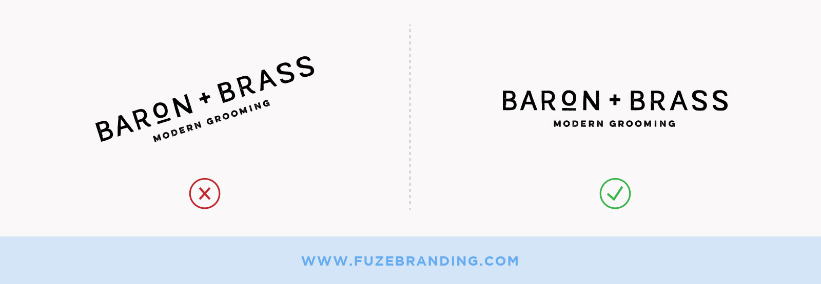
1. Tilting or Changing the Orientation of Your Logo
What It Looks Like:
Why It Matters?
Your logo was developed with orientation and balance in mind. Decisions like the positioning and structure of your logo were considered based on the mood and aesthetic goals of your business. When you tilt it or spin it around like you’re about to enter the ProAm Ballroom circuit, you’re changing how people perceive the logo, which can change how they perceive your business.
It’s the small things.
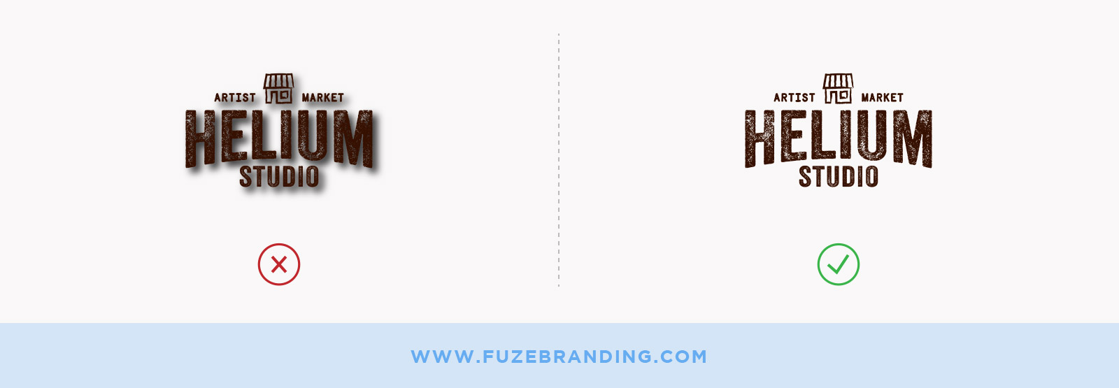
2. Adding a Drop Shadow (Or Any Special Effect) to Your Logo
What It Looks Like:
Why It Matters?
If you’re not (reallllllly) careful, a drop shadow can look pretty dated and out of touch. It can also affect the legibility of your logo. You want your logo to be clear enough to be recognized from a distance. Effects like a drop shadow can add kind of a “blurry,” 3D effect that make your eyes strain to process what they’re seeing.
So yeah, just stay away from experimenting with the special effects.
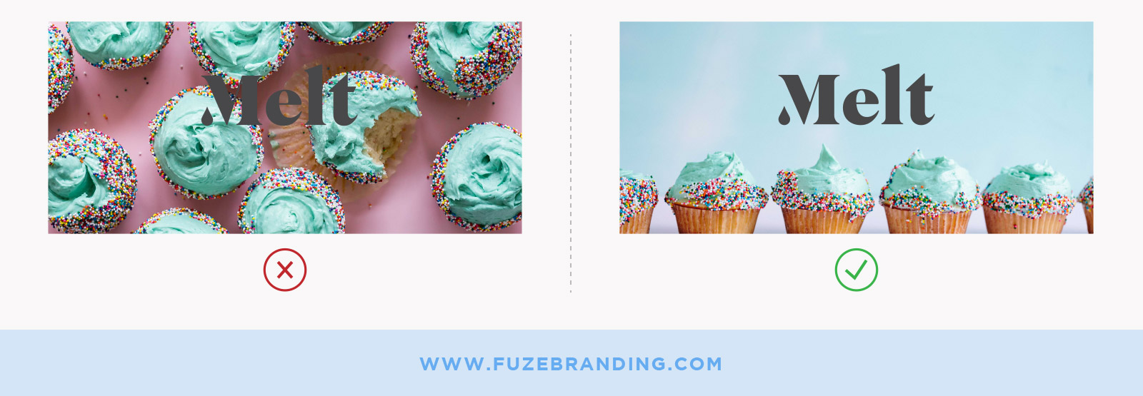
3. Placing Your Logo Over the Wrong Photo
What It Looks Like:
Why It Matters?
This one is tricky. Photo-overlays, when done well, can be really impactful, but when you choose a photo that is too busy, doesn’t leave enough negative space, features the wrong colorway, etc… Well, you cause your logo to fade into a background of visual noise. Definitely not what you want to do with the most iconic representative of your visual brand.
Choosing a photograph needs to be mindful and on-brand. You can create a mood board of photography that aligns with your visual identity and play around with logo overlays. If your branding allows, color overlays, where you apply a transparent, colored layer over the photo, can help simplify the visual “noise” of the image and provide a great canvas for your logo
When in doubt, refer to some of the guidelines for mixing type and photography here.
4. Choosing an Off-Brand Color (Or the Wrong On-Brand Color)
What It Looks Like:
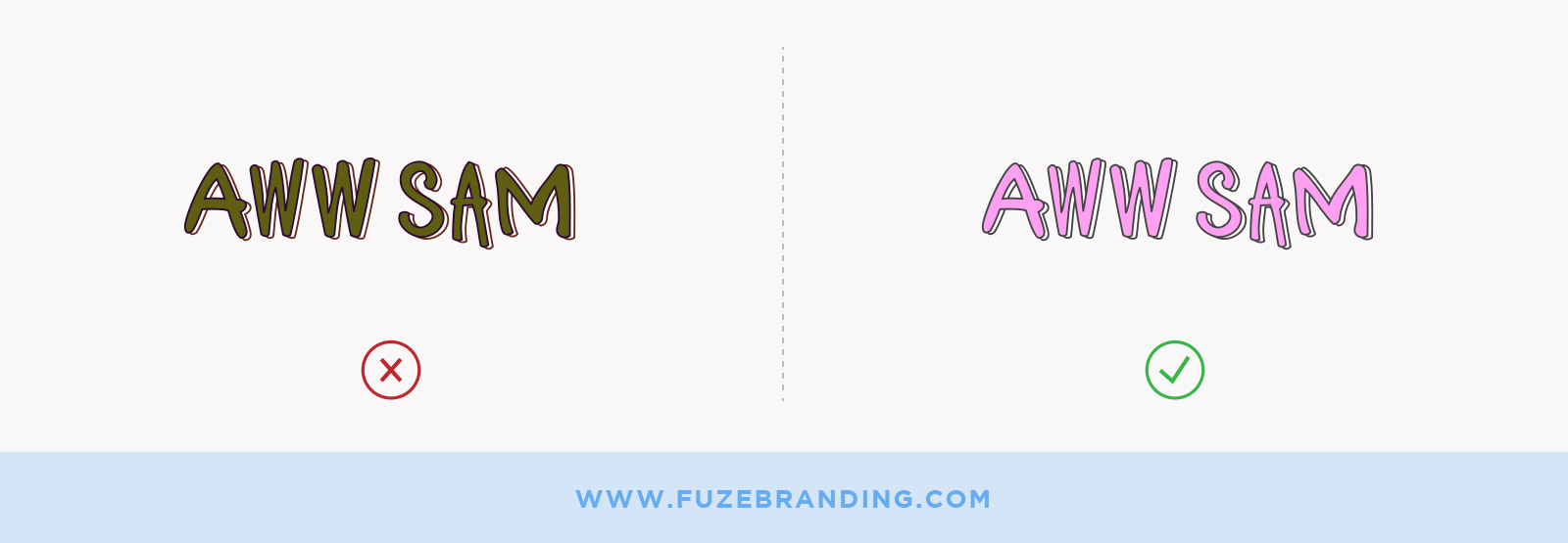
Why It Matters?
Choosing colors outside of your brand palette, or at least outside of the style of your brand palette, cause things to look discordant and cluttered and confuse the messaging of your brand.
When we choose colors for your brand palette, we consider the psychology of color. For example, have you ever noticed that a LOT of restaurants and food brands seem to use the color red? Or similar warm colors? Red is the color of hunger and passion and energy. Red is said to have a metabolic effect on the body, changing blood pressure and even respiration. It is also the color which attracts the most attention out of the color spectrum. (Hey, there’s a reason they use it on stop signs and caution labels).
But what about choosing the wrong on-brand color? It goes back to legibility and consistency. In your completed brand guide, you’ll likely have pre-approved alternative color combinations you can use for your logo and backgrounds, and those were chosen with consideration to making your logo look (and read) the best it can.
5. Recreating. Your. Logo.
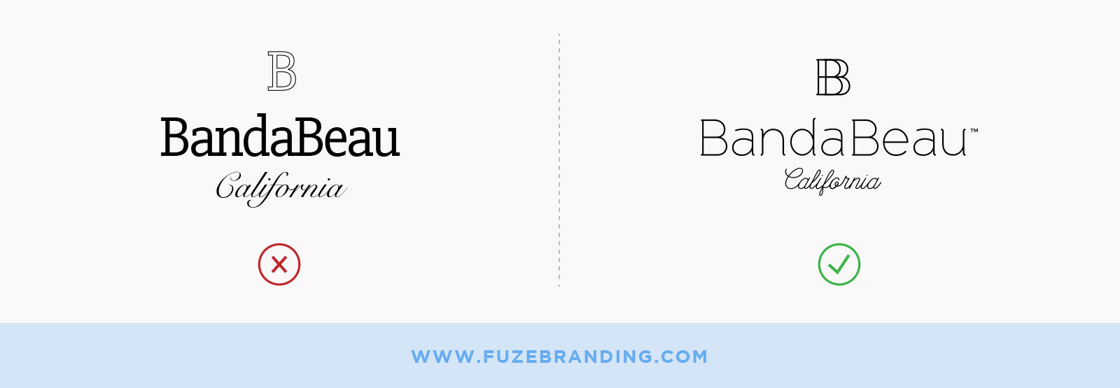
What It Looks Like:
Why It Matters?
For. The. Love. Of. God. Do not attempt to recreate your logo by choosing similar typography or what-have-you. We’ve seen this happen a million times, especially when it’s time to rebrand or craft new assets, and OOPS! The vector (workable) copy of your logo has gone MIA.
When working with a credible designer or agency, you should always receive a workable copy of the design you purchase. It’ll likely be a file with an extension like .ai (Adobe Illustrator), .eps (Encapsulated Postscript), or .svg (Scalable Vector Graphics), and that’s the master file where your design was created. The very best version.
If you try to just…”recreate” it, it’s going to look weird. Trust us. A logo that looks a little (or a lot) off like that is going to look less credible.
6. Scaling Your Logo Incorrectly
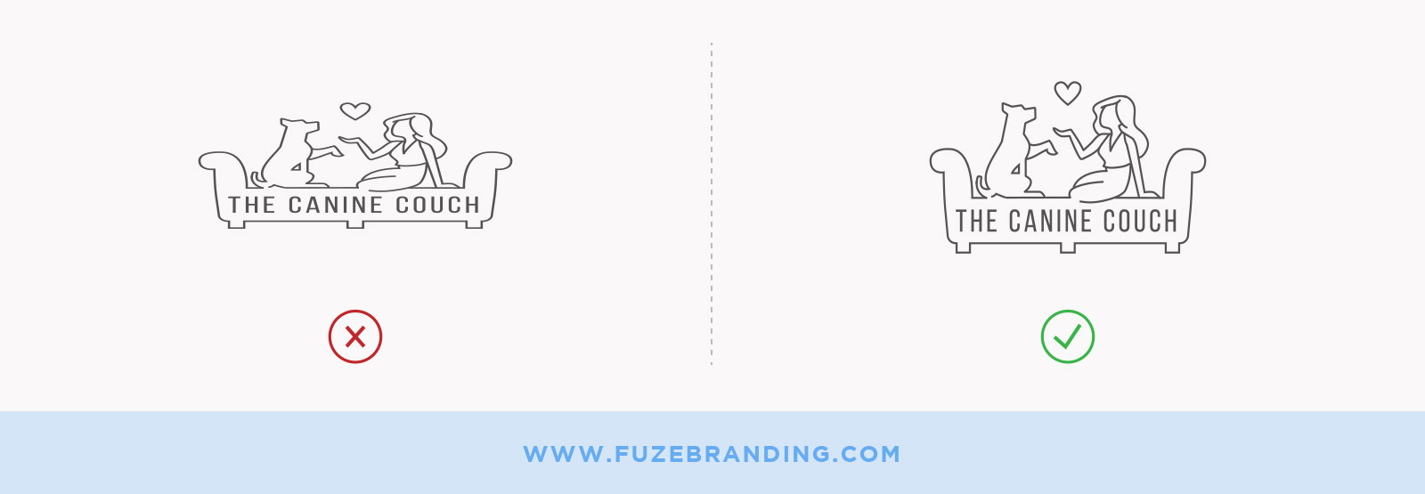
What It Looks Like:
Why It Matters?
Your logo isn’t saltwater taffy, so quit pulling on it like that.
When you scale your logo to fit or fill a space in an image editing or illustration program like Adobe Photoshop or Adobe Illustrator, be sure that you’re doing so proportionally. Select the image and grab a corner. Hold down the Shift button as you drag your image to the size you need.
If you just grab it from one side and start making adjustments without holding down the Shift button, the image will be skewed and will look like it’s being viewed in a funhouse mirror. No Bueno.
7. Adding to Your Logo
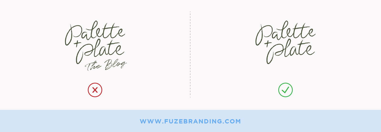
What It Looks Like:
Why It Matters?
We’ve said it before, and we’ll say it again… It dilutes the impact of your visual brand and can cause message confusion. And legibility problems. It’s bad, okay? Just don’t do it.
Seriously though. Your logo is meant to stand alone. That whole “distilled brand drop” concept again? It’s part of the reason that we create guidelines like clearspace requirements, the amount of space you must leave between the edge of your logo and any other object. We want to ensure that your logo never looks like an afterthought or just part of the visual noise.
If you want to have a specific image that features your tagline or an aspect of your business, say a blog, your designer can craft a thoughtful, branded image that utilizes your brand guidelines and logo to the best effect.
For example:

8. Pattern-ifying Your Logo
What It Looks Like:
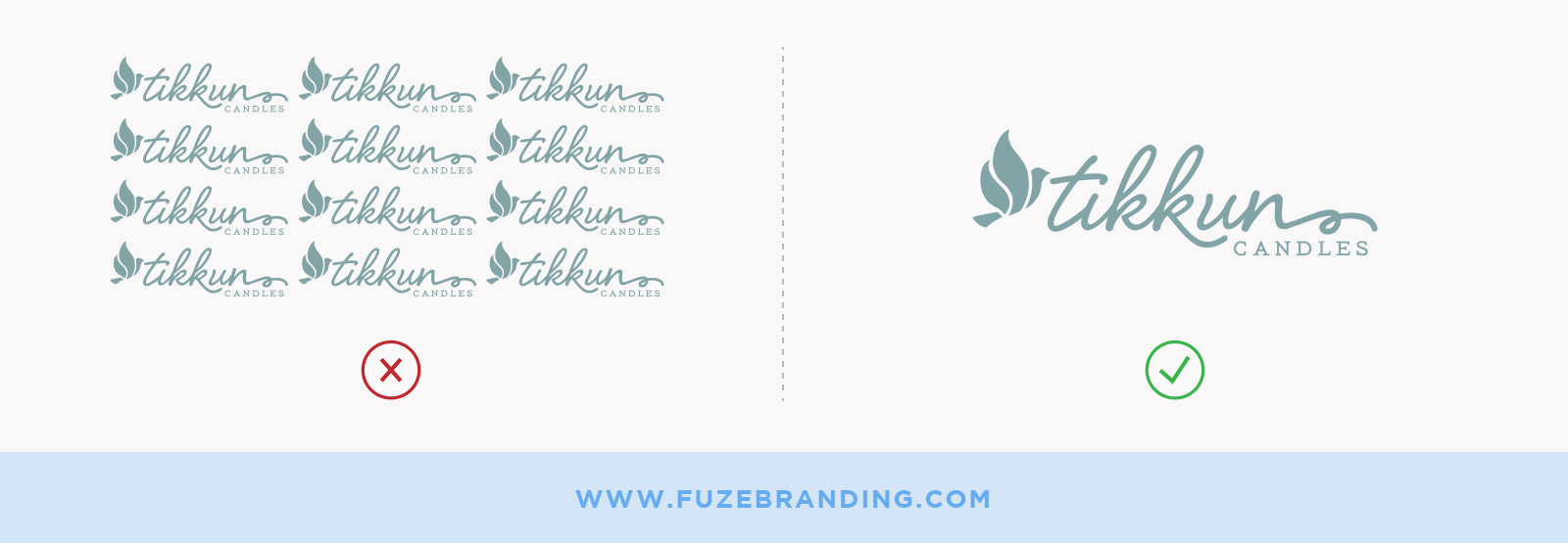
Why It Matters?
This one is tricky. Because it can be done and done well (Think Louis Vuitton’s iconic monogram and Gucci’s logo-inspired “Guccisima”). It takes some real forethought and design knowledge to create a pattern using a logo or an aspect of your logo that enhances instead of detracts from the impact of your brand visually. When it’s not done well, it can just look overdone and amateurish. It can also look a little “fashiony,” which is fine if that’s the intention.
Frankly, with so many glorious options for brand pattern creation…Why not just explore another design device instead
9. Getting Too “Matchy Matchy” With Your Logo
What It Looks Like:

What It Matters?
This one can tie into #7. Except rather than addressing amending your logo, we’ll address how using the wrong typography can affect the impact of your logo.
When we’re choosing a brand font family, one of the things we’re considering is how to balance and compliment your logo without competing with it. In the example above, the rounded typography of the “Get Coffee” call-to-action is too similar to the style of the logo, and in a design, your eye would have trouble deciding where to land. Maybe they’ll get coffee…But it might not be from you.
Woo… Those were some of the Top 9 ways we’ve seen people wreck their fancy logo. Thank GOODNESS you weren’t doing any of those things, right? ????
Are you struggling with a design problem? Unsure if you’re “doing it right” ? Leave us a comment below or drop us a line at laura@fuzebranding.com, and we’ll try to help you get it sorted out.

