Company Naming Visual Brand Identity
Work in Progress: Real Estate Branding & Personal Branding for a Travel Photographer
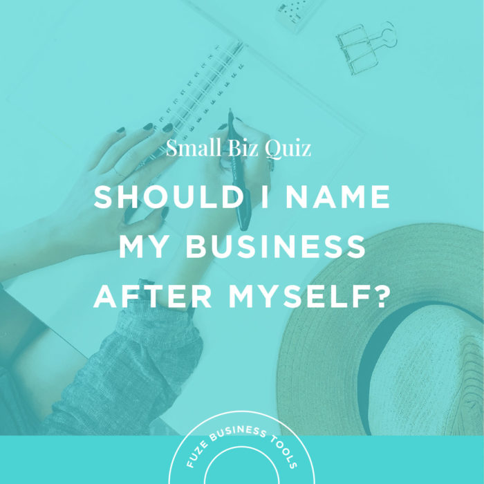
January was chock full of client work and the launch of our long awaited workbook: The Expert’s Guide to Company Naming, the most comprehensive guide to creating a meaningful, strategic name for your company or product.
Here’s a peek into two of our current visual identity projects:
LendScout
LendScout is a real estate company that specializes in working with prospective homeowners looking for a “stress free” lending process. Powered by American Security Mortgage, LendScout is based in Charlotte, North Carolina, and their team is passionate about cultivating relationships and building communities with their clientele. We helped them develop a company name that felt modern and approachable, and now, we’re working with them to develop a visual identity that is fresh and compliments the branding for American Security Mortgage.


For LendScout, we implemented a brighter, more welcoming color palette that still feels aligned with American Security Mortgage. The new brand palette reads like the younger, modern cousin of the traditional colors of the original palette. We also carried that theme into custom brand illustrations that have a more fluid, approachable style. Branding for a real estate agency needs to be credible, but for LendScout, it also needs to represent the openness and down-to-earth vibe they hold dear.
Personal Branding for an Award-winning Travel Photographer
We had the pleasure of working with talented travel photog and writer, Sivani Babu, on a previous visual branding project for online travel magazine and journal, Hidden Compass , so when Sivani reached out to us to create her own personal branding, we were excited to work with her again. Sivani’s photography is the best kind of creative inspiration, so we looked to her body of work in creating her visual branding.
We explored several hand illustrated logo concepts drawing inspiration from the open ocean and sailor’s knots to the bold mountain faces she’s photographed.


We also incorporated antique maps and paper textures, brand colors that feel moody and stormy, and traditional typography and hand etched illustrations that add to that world explorer aesthetic.

Interested in checking out other examples of our visual brand identity work? Check out our portfolio here.